27 September 2014

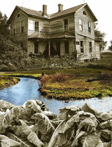
When Nature Reclaims Brick and Mortar

There’s a certain kind of mystery concerning an abandoned buildings that tickles our curiosity.  How has it deteriorated? And why? These places are inspirational and offer up a glimpse into the past, telling us an old story. The concept of ruins photography is also known as "Ruins Porn" and most of the photographers aim to capture and document something that is likely everlasting, important and generally historical in nature. Legends and stories about these decrepit structures are what we find so appealing, along with the adrenaline rush of exploring a forbidden space. 

Personally I enjoy the buildings after nature has taken hold. For me this "art" is not about remembering man, but instead what was there before man made an impact. 

There is beauty in decay, nature conquering what man has left behind.


"Ruins are the visible symbols and landmarks of our societies and their changes ... the volatile result of the change of eras and the fall of empires. This fragility leads us to watch them one very last time: to be dismayed, or to admire, it makes us wonder about the permanence of things." (Yves Marchand and Romain Meffre)

22 September 2014

The Completed Table

The process of having this table manufactured was a great learning experience, however I would not like to be an industrial designer, who I would imagine does this on a regular basis. I sourced manufacturers during the varsity recces period as it was basically the only available time I had to do so. 
At this point I would like to give credit to and thank my mother for helping with phone calls and directions while I drove all over town to these different people, she's such a doll and this would have been extremely difficult to do without her!

The photos that follow are of the final product which I am very satisfied with. And the process was relatively headache free!


Assembled, from the side


Puzzle and wing-nut detail

From above, the concentric nature of the paint technique and puzzle is very apparent

Close up of brilliant welding job
A 1:2 scale model to show the design of the coffee maker (my second product)

There are still a few tweaks that need to be made until it is perfect:

  • The hole through the puzzle pieces is skew and therefore the pieces don't turn all the way inside each other.
  • The pin onto which the top fits is too long so that needs to be cut down.
  • A change to the design will be made to remove the wing-nut and instead have the smallest puzzle piece simply fit onto the pin as a 'cap'. Therefore the hole in this piece needs to be filled and re-drilled but only about 4mm deep from the underside.
Hope you enjoyed the design!

16 September 2014

My First Computer Animation


Using 3D Studio Max I created a video that shows the existing elements to be removed from the building and following that, the construction of the proposed new elements of the design.

20 August 2014

A Growing City


A city grows from the ground and its context. 

Lines represent connections between building within an urban context. Movement throughout a city determines the development of communities and this dictates how people interact with each other. A good community vibe is as a result of walkable neighbourhoods and close proximities to human needs. More people in the street provides more opportunity for social interaction. 
A mixed use building facilitates these 'pathways' inside the building with all needs provided in one spot, thereby becoming the community...

Contrasting line and shape are symbolic of the architecture as well as culture in Port Elizabeth and South Africa in general. The mixture and unusual combinations of  architecture, historic and contemporary, tall or short, relates to these dynamic sculptures(particularly the last, golden one). The geographic context of Central, where the proposal will take place consists of steep hills and 'cliff faces' and because of this, a common sight is buildings that see to be balancing on the edge or becoming part of the rock as if they 'grew' from it! 

Trafalgar Centre (proposed building) is on top of this hilly part of central and is therefore the point where this all connects. It is fitting that the design concept should reflect this 'growing', 'developing' 'combining' idea.


Hyper-realistic Renderings. Computer Aided Design


I found an interview with Henry Goss, the architect and visualiser who produced these renders for "Staithe End House". Goss talks to Dezeen about how 3D visualisations are becoming indistinguishable from real photographs an how this in itself can be a problem for designers as the final product may look worse than the render!


Goss says that 3D renders are already almost indistinguishable from photographs, but are being taken to the next level by "the addition of real world imperfections. Scratches in metal, splinters and chips in timber boards, even fingerprints."


Goss believes there are three categories to sucessful architectural visualisation:
1. A technical understanding of the software, this may be obvious but it is impossible to have proper control without having a fairly good knowledge of the tools you are using.
2. An understanding of architecture. An architectural visualiser who has no real appreciation of their subject matter will never grasp the subtleties of what they are attempting to recreate.
3. An understanding of architectural photography. This is often the most overlooked and potentially most important aspect of the three.


Its hard to believe that an image with such depth of field was created with computer software!

The whole 3D industry is heading in the direction where you have a single model of a building which can hen be used by architects, engineers, interior designers as the architectural components, building services components and the structure can all be edited in this one model.
Computer-aided design has now reached a level where it's all becoming very integrated and very easy to collaborate with all members of a project


08 August 2014

Product Design

The Concentric Convergence
-a table to encourage interaction

This table will be used in the Hi-Bru coffeehouse as an alternative seating as apposed to the proposed fixed bar seating which will be a feature in the space. 
The product needs to incorporate the theories that I've chosen to base the entire design concept on. 

New Urbanism:
Sustainable urban design principals. The weaving element of the wire represents a 'growing', or 'connecting' to the urban environment. The choice of materials also relate the design to its urban context: concrete and steel and a touch of timber for a contrasting, tactile aspect. This contrasting element is also part of my concept and stems from the inspiring contrasting nature of South Africa.

Architecture and Society (Environmental Psychology): 
I question how do people react to and with this table. Also how does it affect the behavior of people with each other. A puzzle is included in the design of the tabletop. This induces interaction with the design as well as with the person sitting with you at the table. The design concept of Hi-Bru is to connect different people and cultures through the experience of coffee therefore this is quite fitting.

The Design

Inspirational mood board
A 3D sketch of the design
A front elevation of the table, note the staggered feet attachment (symbolic of growing from its context)

Below is the presentation poster that i submitted today. The conceptual development is also included here if you would care to know more detail. 
This table will be manufactured to full scale as the second part of the project, within a budget of R1500 if possible.

The second product  will be a vacuum coffee maker and will follow in another post!